- ファイル
-
デザイン
-
-
すべてのカテゴリ -
Category #1 - 新たなカテゴリー
-
My designs
-
-
ヘルプ
-
Quick help
- ctrl+a
Select all objects
ctrl+d Double the activate object
ctrl+e Clear all objects
ctrl+s Save current stage to my design
ctrl+o Open a file to import design
ctrl+p Print
ctrl++ Zoom out
ctrl+- Zoom in
ctrl+0 Reset zoom
ctrl+z Undo changes
ctrl+shift+z Redo changes
ctrl+shift+s Download current design
delete Delete the activate object
← Move the activate object to left
↑ Move the activate object to top
→ Move the activate object to right
↓ Move the activate object to bottom
shift+← Move the activate object to left 10px
shift+↑ Move the activate object to top 10px
shift+→ Move the activate object to right 10px
shift+↓ Move the activate object to bottom 10px Resources
The resource is placed you can upload your image, reaching clipart/shape stocks to add to your design. Of course, in here you can see the product info and attributes or printing methods as well.
We have tabs bellow: Product, Templates, Layers, Text, Cliparts, Shapes, Images, Drawing
Product Info
This tab includes product info and attribute. From here you can change to other product quick as quick via Change Product button. There are colors option for you select to place an order or add your colors if shopper enables the current product. When you change an attribute or select printing method the price is updated automatically.
You can also choose other product to design.

Templates

There are many available templates, you can click to add templates to the product
Layers

All layers which you added to design display on this tab. You can show/hide layers via visibility option. Or delete layers.
Text

To use text in your design, just reach to this tab and select pre-made texts or select font style you want to add then click to add them.
To show more font styles, just press Load more 1000+ Fonts the new popup show up which allow you add more fonts to list.
Cliparts
This tab includes images which uploaded from admin panel by the shopper or from Lumise stocks.

To add clipart to the design area, just click on them.
Shapes
Like clipart, this tab allow customer reach to ideas they want to use via the search box and categories filter. But Shapes are vector format which helps design have smooth details when zoom or export to big size without mess up.
Images
This tab, allows you upload your pictures, or get them from your social account or some image stocks such as Pixabay, Openclipart.

Drawing
This tab is setting to prepare draw info. You can select a color, size of the bush.
Design Area
This is the most important part of Lumise editor. It is preview and workspace for all layers you added.
To adjust layer, just use the mouse to click on them or select all of them via drag mouse.

Image Toolbar
With an image added into design area. There are some options for it. To enable options, just click on an image and see the top toolbar as below:

Image mask

Do you want to make text with complex background from another image?
Yeah, it does that with Text Mask feature.
How to create text with mask background? View more
Remove Background

Image Filter Effects

Crop Image

Menu
As an application on the desktop, there are some menus included on Lumise.
File

New Design: Start new empty design for the current product.
Import Design: Import design from your local which you exported from Lumise
Clear all: Clear current design to empty
Save as file: current export content on design area to a file
Make a Copy: Duplicate your current design content on area to new design
Download: export your design to another format: SVG, JPG, PNG, JSON, PDF
My Design
This is management of all your designs on current PC

With each design, you can duplicate or focus edit and delete it.
To start new design just press New Design button
Print

Just select a size or add your custom size to print or download result.
Help
Some guide for you to use Lumise Design Editor easier.
Undo/Redo
They are useful featured on Lumise, you can track back to your works easier.
When you finish designing the product, you can click "Process" to add the product to your cart.

Then you can choose "Start new product" or "Checkout"

Edit cart
You can click cart icon to see your cart

Firstly, we must understand what Product Base is.
Product Base looks like as a design template which used by many similar products from CMS can use to allow user edit or selling directly this product with a template design.
Management
To manage Product Base, just go to Admin panel > Product Base then you can see some menu here.
Firstly, the list of all products added.
In this area, you can see the stages thumbnail of product, name, SKU and some filter options on the top as well.
You can customize the display of this screen’s contents in some ways.
Bulk Actions : You can also edit or remove multiple items at once. Select the items you want to act on using the checkboxes, then select the action you want to take from the Bulk Actions menu and click Action.
- Active : Show selected products on product list when assigning with CMS product.
- Deactive : Hide selected products on product list when assigning with CMS product.
- Delete : Remove selected products.
Add/Edit Product Base
To add a new item, just click on menu or button Add New Product Base. And select on of item in the list to edit that one.
You got screen bellow after that:

There are 3 tabs for each product:
- Details – Some details information for product
- Design – Config designs for each stage of product such as front, back, left, right
- Attributes – Config attributes of products to use for add to cart.
Details
There are many fields to put into a product.
- Name : The name of product which displays on the list
- Price : The base price for products. The total product of product will depend on price base, attributes prices, printing method selected.
- CMS Product ID: The main product CMS which assigned to this product base. Each product base must have one main product CMS, but multi CMS product can be assigned to a product base.
- Description: Short description of this product.
- Categories: Select one or more categories which product base belong to. Helpful on sorting items
- Printing Techniques: Printing methods which can apply to this product base.
- Active: Enable/Disable clipart on front-end.
Design

There are many options for a design of a product. The important is design area.
Lumise support drag and drop method for you can arrange area and size range as well.
- Allow Change Color
- No display product color: disable select product for product, it means product just have one color pre-selected
- Only choose from set of colors: User can change product colors, but they just can choose from set of colors
- Choose from a set of color and color picker: It’s mean there is not limited to color for this products. The user can select from a set of colors or put their own via color picker.
- Set Product Colors: Choose and add colors for product
- Configure Stages: Setup design area and design base for each stage.
Notice: The great feature on this tab is assign pre templates for stages of the product. It is helpful in case you want to sell directly product or just set default template to edit for users can start customizing.
Attributes
Lumise support follows product attribute types:
- Size – the set of sizes attribute for a product. You can add any size you want
- Dropdown – a list of dropdown select items of attribute
- Text : The text box for user can set their notice when add to cart a product
- Upload: User can upload their notice via this type attribute
- Radio: Display list of option for one attribute on product
- Checkbox: Display list of options for multi-select values on an attribute.

Of course, each of them has price base and require once checkout as well.
After filling your content, just press the Save Product Base button to store data.
Checkout Lumise Documentation
You have to create methods for users select when purchasing a product.
To manage them, just go to Admin Panel > Printing Types

In this area, you can see the printing thumbnail, name, description and some filter options on the top as well.
Bulk Actions: You can also edit or remove multiple items at once. Select the items you want to act on using the checkboxes, then select the action you want to take from the Bulk Actions menu and click Action.
- Delete: Remove selected printing methods.
Add/Edit Printing
To add a new item, just click on menu or button Add New Printing. And select on of item in the list to edit that one.
You got screen bellow after that:

There are some fields to put into a method.
- Printing Title: The name of method which displays the list
- Printing thumbnail: Upload your own preview thumbnail for this method.
- Description: Some describe text for this method.
- Calculate Price: The config for price calculate a price for this method.
- Active: Enable/Disable shape on front-end.
After filling your content, just press the Save Printing button to store data.
Calculate Price
Each method has own way to calculate the price. The Lumise provide some options to enable that.
Firstly, Lumise allows you select format to calculate price base on values on each stage or from all values of stages via option Allow setup price for each stages setting. When turning on it, you can see more stages option show on current option calculate.
We have some options calculate as:
- Base on a number of resources: Text, Clipart, Images, Uploaded Image…
- Base on number of colors: 1 Color, 2 Color or full color
- Base on size of print production: A1, A2,…A6
- Fixed price for each quantity
Of course, all options base on the quantity range which user want to orders.
For example, Their design has 2 colors and they order 7 products. And base price of product is $10
We have calculated price table as:
quantity / 2 colors
———–
5/0.5
———–
10/0.7
So price for product is: (price base + option price )*quantity + printing price = $10*7 + 0.7 = $70.7
option price : equal 0 in this case.
printing price : 0.7 because quanity in range of 5 and 10, So it take price of 10.
Checkout Lumise Documentation
Copyright © 2020 DShowcase.jp.
All Rights Reserved.Powered by Lumise version 1.9.8
-
- Shop

- 元に戻す
- やり直し
-

-
 English
-
Japanese
言語
-
- 0.0
-
カート
- ショップに戻る
- 設計
- 製品
- テンプレート
- テキスト
- シェイプ
- お絵かき
- レイヤー
テキストを追加するには、クリックまたはドラッグしてください


自由描画モード
-
Start designing by adding objects from the left side
- All selected objects are grouped | Ungroup?
- Group objects Group the position of selected objects
-
-
塗りつぶしのオプション
この色を保存
-
- QRコードを作成する
-
オプション
-
Automatically align the position of
the active object with other objects -
ON: Keep all current objects and append the template into
OFF: Clear all objects before installing the template -
Replace the selected image object instead of creating a new one
-
- Replace image
- 作物
-
マスク
-
マスクレイヤーを選択
-
-
背景を削除する
-
背景を削除する
-
深い:
-
モード:
-
-
フィルタ
-
フィルタ
-
- Original
- B&W
- Satya
- Doris
- Sanna
- Vintage
- Gordon
- Carl
- Shaan
- Tonny
- Peter
- Greg
- Josh
- Karen
- Melissa
- Salomon
- Sophia
- Adrian
- Roxy
- Singe
- Borg
- Ventura
- Andy
- Vivid
- Purple
- Thresh
- Aqua
- Edge wood
- Aladin
- Amber
- Anne
- Doug
- Earl
- Kevin
- Polak
- Stan
-
輝度:
-
飽和:
-
コントラスト:
-
- フィルタをクリアする
- クリックしてマウスをドラッグして描画を開始します。 Ctrl+Z = undo, Ctrl+Shift+Z = redo
- QRコードテキスト
-
塗りつぶしのオプション
-
塗りつぶしのオプション
この色を保存
-
トランスペアレント:
-
ストローク幅:
-
ストロークカラー:
-
- Ungroup position
-
レイヤーを整列する
-
ポジション
-
Object position
Lock object position:
-
中心垂直
-
左上
-
トップセンター
-
右上
-
センター水平
-
左中
-
ミドルセンター
-
中右
- ←↑→↓を押すと1ピクセル、SHIFTキーを押すと10ピクセル移動する
-
左下
-
ボトムセンター
-
右下
-
-
変換
-
回転する:
-
スキューX:
-
スキューY:
-
フリップX:
フリップY:
SHIFT pressを押して自由に変換する
-
-
フォントファミリー
-
Edit text
-
Edit text
-
-
フォントサイズ:
-
文字間隔
-
行の高さ
-
-
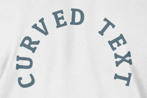
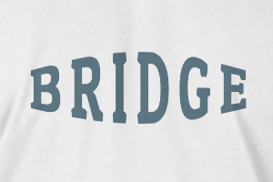
テキスト効果
-
テキスト効果
-
-
半径
-
間隔
-
曲線
-
高さ
-
オフセット
-
トライデント
-
-
テキストアラインメント
- 大文字小文字
- フォント太字
- テキストスタイルイタリック
- テキストの下線